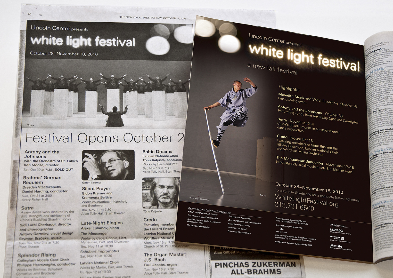
Lincoln Center created the White Light Festival in 2010 to connect with audiences on a more spiritual level. The festival’s focus on music’s transcendent capacity to illuminate our larger interior universe was born out of the desire to interact more intimately with the audience and have them interact with each other.
White Light Festival was seeking a visual brand that would communicate it’s compact yet powerful reach.
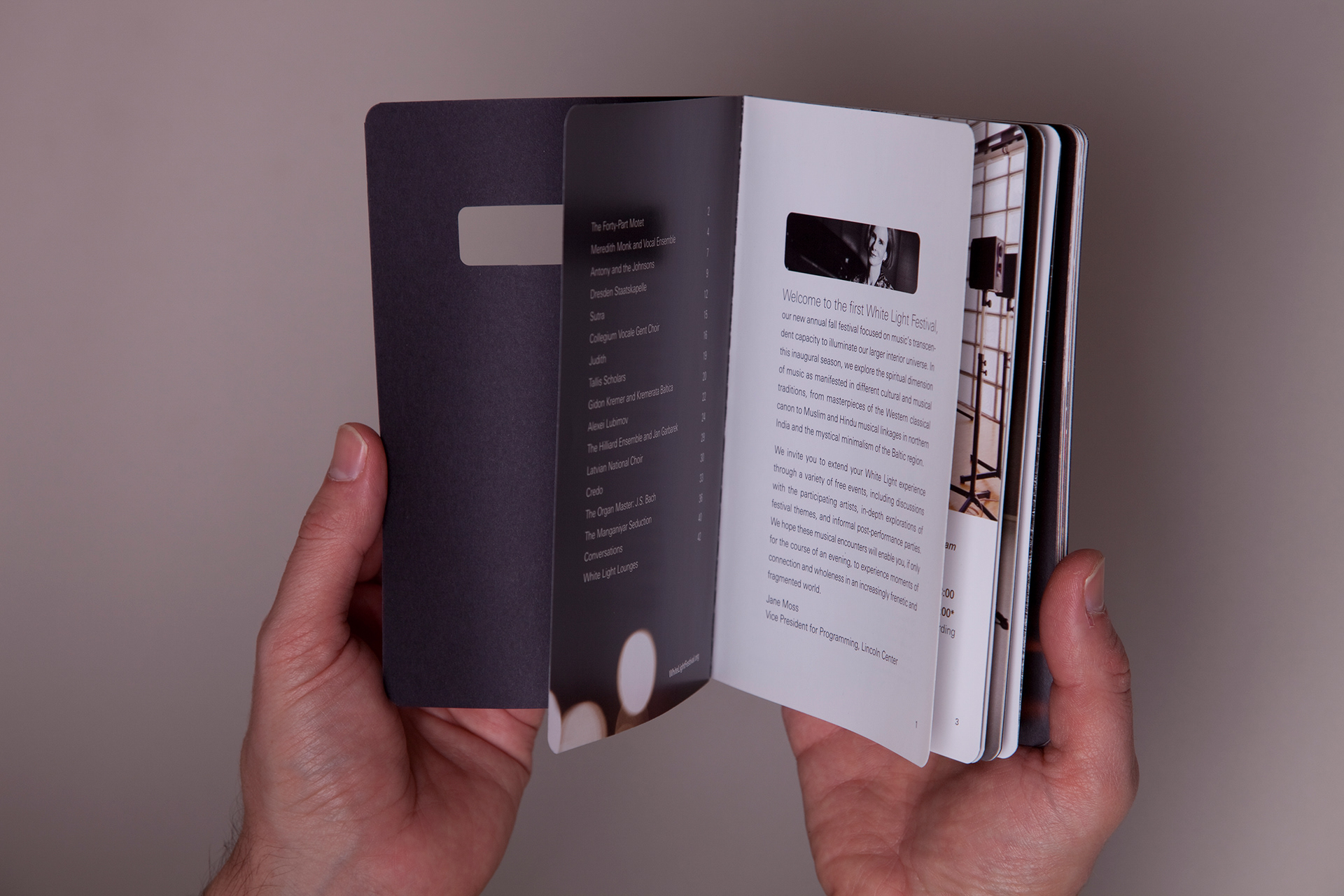
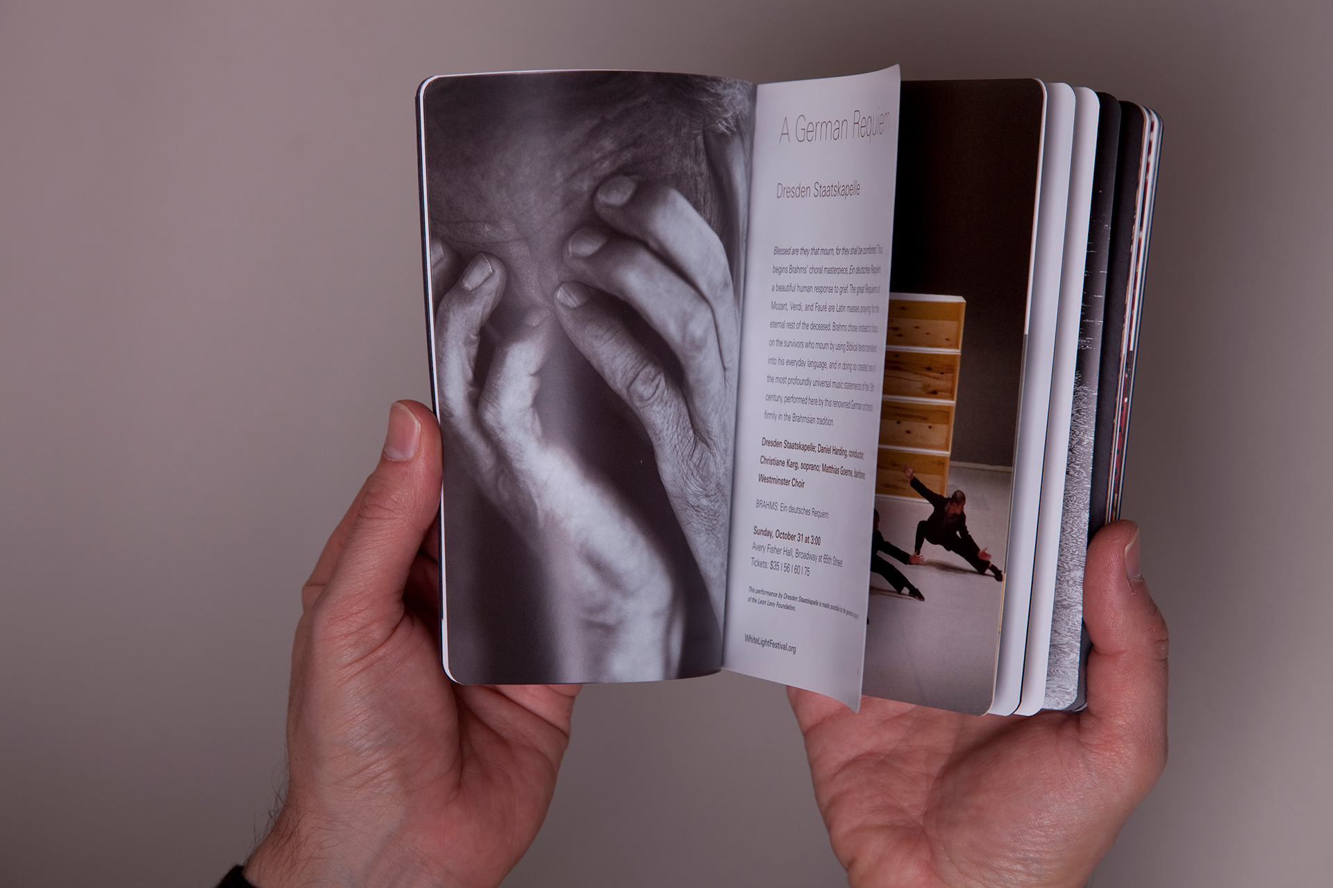
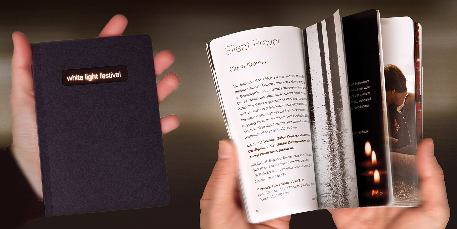
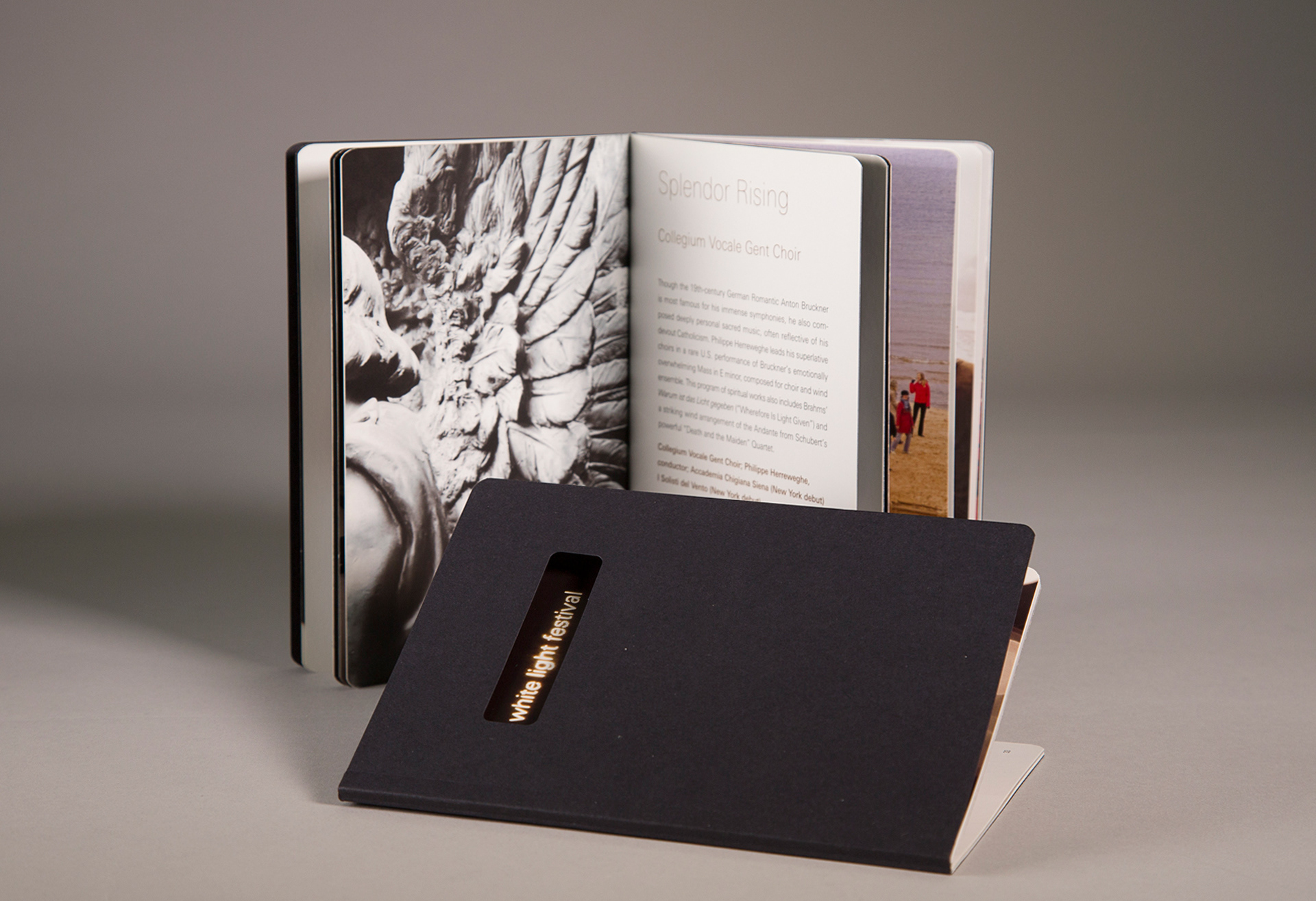
The small black book became the vehicle for expressing the soulful and often sacred nature of the artists’ work along with the vision of it’s curators.
I designed the black book with soft rounded corners to be held in the palm of the hand, like a prayer book. I made it small enough to cradle and carry away, rather than leave it behind in the concert hall, like so many other programs and brochures before it.
It was designed to function both as a direct mail brochure to attract interest and result in subscriptions, as well as a program guide with blank pages for notes that was given to every audience member as a gift. After the first performance, there were fewer than 10 books left on the floor of the hall.
Lincoln Center will celebrate the White Light Festival’s ten year anniversary in 2020, and the black book is still in use.
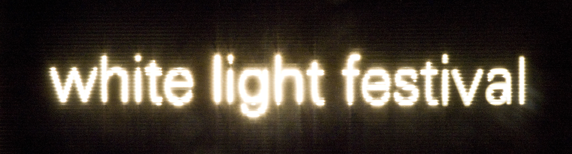
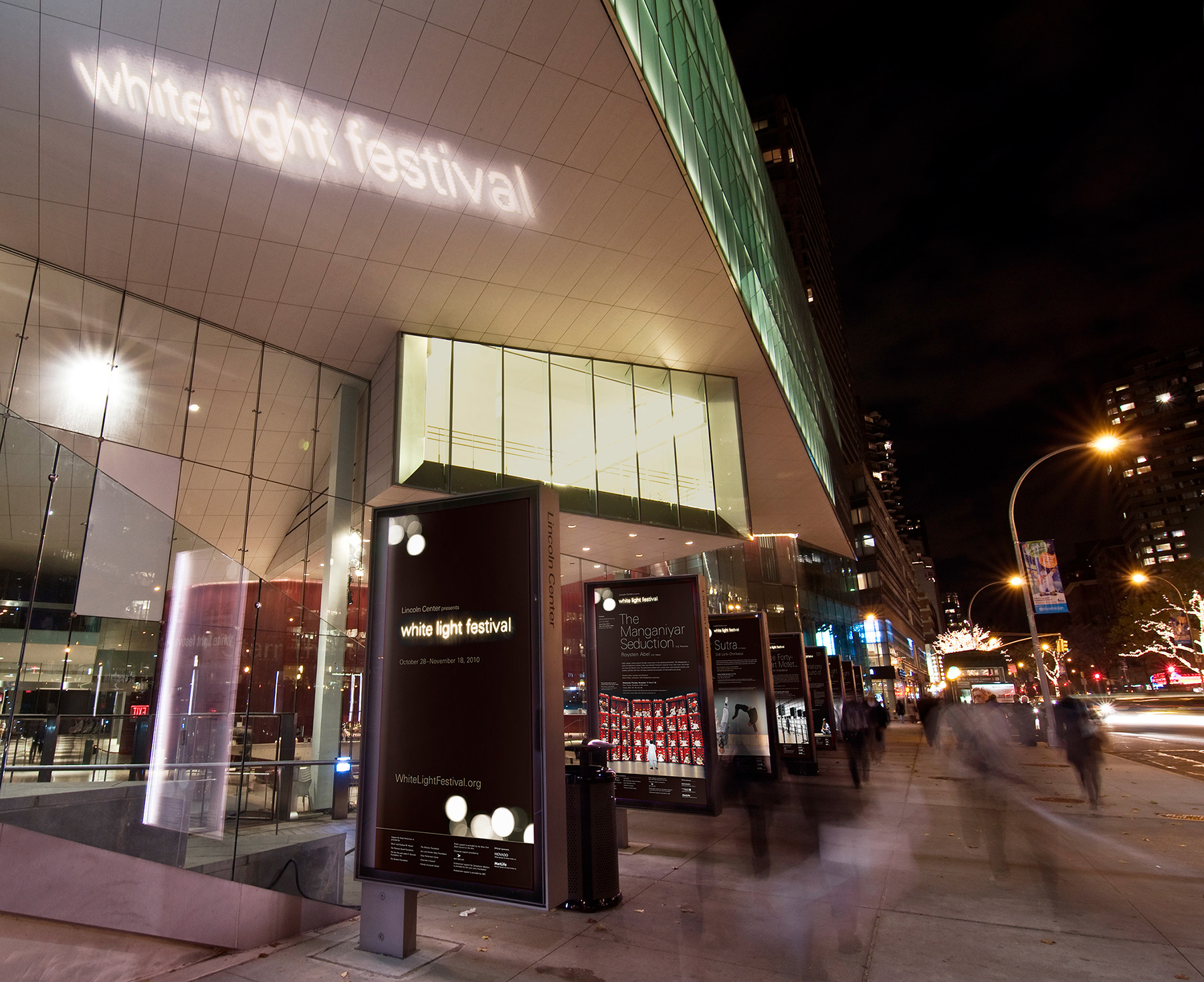
The White Light Festival logo
I hand cut the letters out of paper with a blade and held it up to a ridged glass window with a strong light shining through it from behind.
I photographed it several times to achieve the glow. The characters vibrate like strings making sounds. The rectangular die-cut in the cover of the book serves as a window and invites the user to open it.
This logo can never be duplicated. Like each live performance, it is truly unique and reflects the luminous joy that the festival brings to its audiences.